Exploring a New Dataset With Python Part II: Using Seaborn To Visualize Data

Welcome to Part II of Exploring a new dataset with Python! If you missed Part I: The Basics, you can check it out here. In this article, we’ll be returning to our animal mug company’s dataset to continue our exploratory data analysis and answer some new questions about our dataset.
We’ll be using Python’s Matplotlib and Seaborn data visualization libraries to create our charts. Since we’re creating these visuals for the sole purpose of understanding our dataset, we won’t be getting into any customization features related to titles, labels, and color schemes. The Seaborn documentation is a great resource for this if you need to create more aesthetically pleasing visualizations for a dashboard or if you just want to play around!
Alright, let’s go exploring.
Set up your data for analysis with Seaborn
Import the following libraries, your data file, and check the head() to make sure it imported properly.
Exploring Numerical Variables with Seaborn
Distribution of a numerical variable
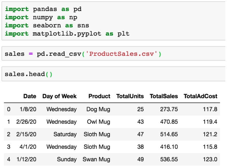
To see the overall distribution of any numerical variable, we can use Seaborn’s distplot, basically their version of a histogram.
Below, I’m passing in the TotalSales column to see my distribution of revenue from orders, which I can see follows a normal distribution.
Swap out the column name in the function to check out the distribution of each of your numerical variables.
Relationships between two numerical variables
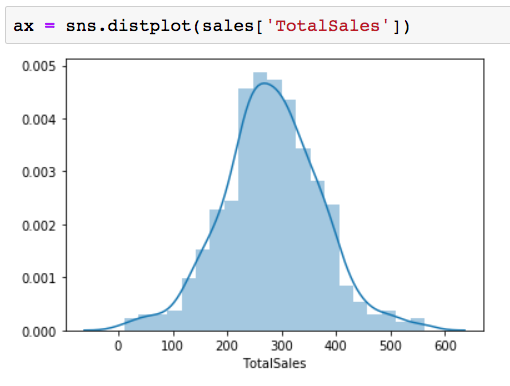
Pairplot is an awesome and easy (only pass in the name of your DataFrame!) way to use Seaborn to get a high-level look at relationships between all of your numerical variables.
For example, the chart in the middle of the top row is using TotalSales on the x-axis and TotalUnits on the y-axis. We see a straight diagonal line which makes sense since the TotalSales column is calculated by multiplying how many units were sold in the TotalUnits column by the price of the mug. As units sold go up, so does revenue!
Choose your own numerical variables to compare
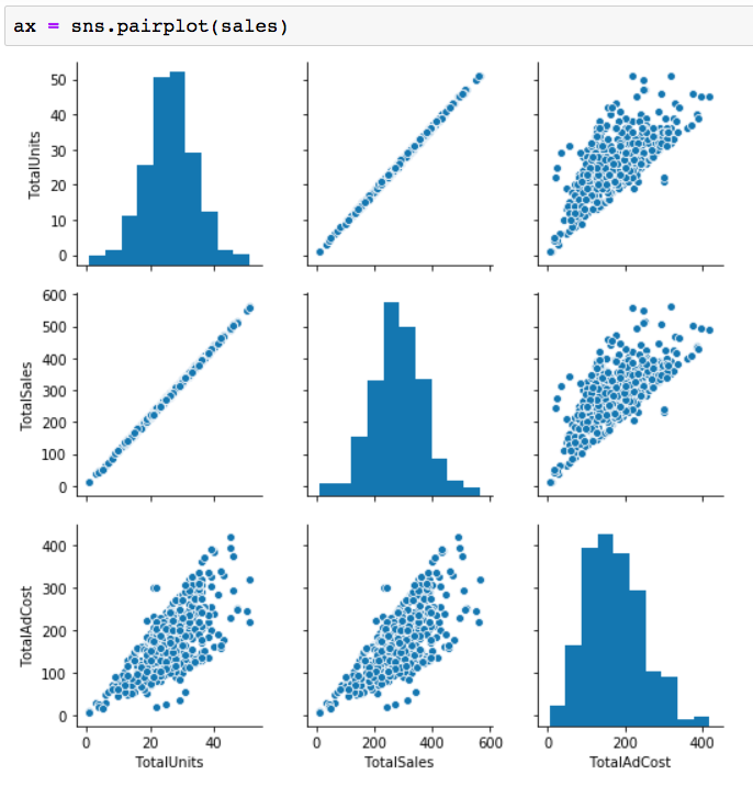
If you’re interested in diving deeper into any of the charts from pairplot, Seaborn’s jointplot allows you to choose numerical variables to pass in the x and y-axes.
In the example below, I’m comparing TotalAdCost with TotalSales (revenue). We can see the individual distributions of both, along with the relationship between them in the scatter plot. As we would hope, as our ad spend goes up, so does revenue.
Check for outliers
It’s important to know if outliers exist in the dataset so they can be handled appropriately - whether that means it should be removed, is an error from data collection that needs to be fixed, or left in. Luckily, Seaborn’s box plot makes it simple to identify outliers in your data so you can take the appropriate action. You’ll be able to see in a second if there is a value or values in any one of your columns that are straying from the rest.
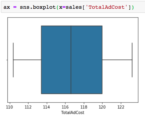
Set the x-axis to any of your column names to check for outliers in that column. Using my TotalAdCost column as an example, we get a completely normal looking boxplot with no outliers identified:
To demonstrate how the box plot would look if there were an outlier, I changed one of my values in the TotalAdCost column to fall outside the normal range:
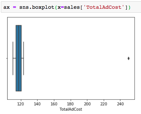
The little dot shows that we have an outlier falling around the 250 mark - quite a bit away from the max value, falling around the 123 mark.
I’d then repeat this process for the remainder of my numerical columns to find any other outliers that exist in the dataset.
Using Seaborn to Explore Relationships Between Numerical & Categorical Variables
Distribution of a numerical variable across categories
In the previous section, we used Seaborn’s box plot to only look at one numerical variable. We can also use it to look at two variables - assigning one to the x-axis and one to the y-axis to see the distribution of a numerical variable across a categorical variable.
Here, we’re looking at the distribution of revenue for each day of the week.
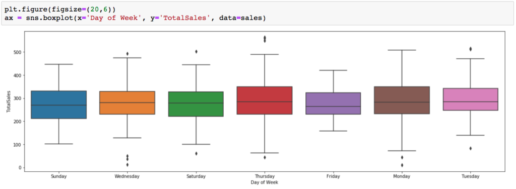
Outliers will make an appearance here as well - we can see a few unusually low revenue orders on Wednesday, a few unusually high ones on Thursday, and a couple others throughout the chart. In terms of distribution, days like Monday and Thursday have much wider ranges in revenue than a day like Friday.
Stripplot offers another way to view distribution
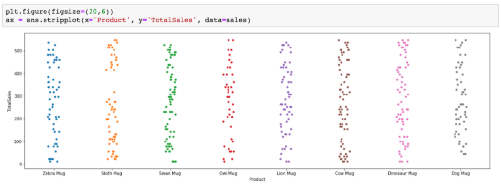
Seaborn’s stripplot also gives us a look at the distribution of values in each category in a different way than the box plot. The visual is simplified with the elimination of quartile information, and it also shows each data point as a dot if you’re more interested in seeing where each observation lies.
In the example below, we get a look at the revenue brought in from each animal mug. Each data point shows how much a typical order brings in for each mug, so we can understand the lowest and highest amounts, the most frequent order amounts where there is clustering, or where values don’t occur at all (like the gap between ~320 and 400 in the sloth mug column!)
Now that we have the tools to learn everything there is to know about the distribution of our data, let’s move on to some different types of comparisons.
Comparing counts across categories
Seaborn’s countplot allows us to compare the number of occurrences in each category. We only need to pass the categorical column we want to look at in the x-axis and count will automatically apply to the y-axis.
In this example, I’m looking at the Product column to see how the sales of each animal mug compare:
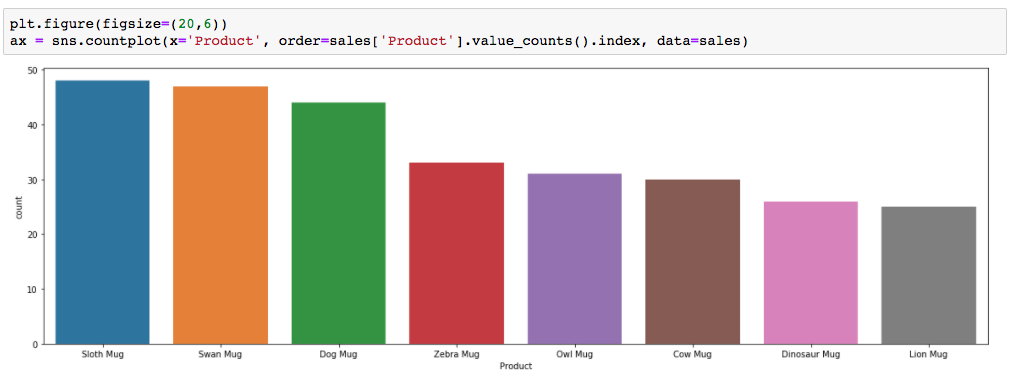
I can quickly see that my top sellers are the sloth, swan, and dog mugs, and the least sold are the dinosaur and lion mugs.
Note: By default, the counts are not sorted in ascending or descending order. To see which categories were highest and lowest a little easier, I added this portion of code to order them: order=sales[‘Product’].value_counts().index
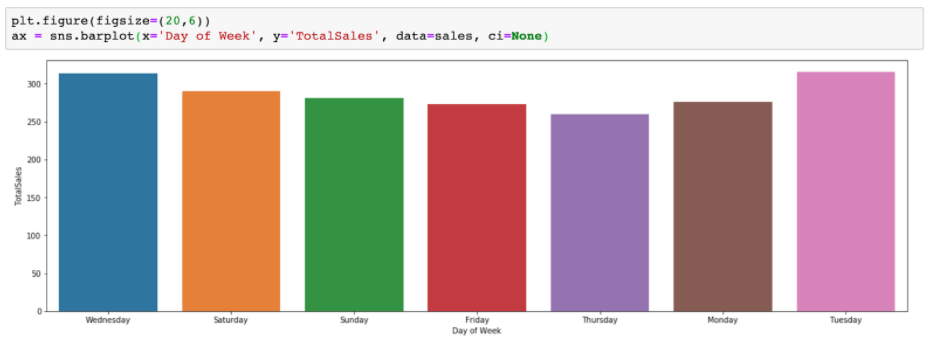
Comparing averages across categories (or other aggregate function of your choosing)
Seaborn’s barplot is basically countplot with more options since here we can add a variable to the y-axis, and also specify what type of aggregation we want to see.
By default, the barplot will use the mean as the aggregation. For example, the barplot below shows the average revenue generated on each day of the week.
To use a different aggregation, like the sum, the estimator parameter can be used.
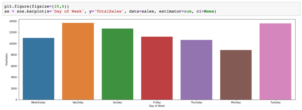
The values on the y-axis got much higher as we’re now seeing the total revenue brought in on each day during the time frame of our data set rather than the average in the previous chart.
Visualize Your Own Adventure
We’ve made it to the end of our exploratory data analysis journey together, but the adventure is just beginning! If you’ve gone through both Part I and Part II, you should be well-equipped with the tools you need to learn about your dataset. There really is so much more than can be talked about with Seaborn, and other visualization libraries for that matter. There are tons of ways you can customize your visuals further, not just for aesthetic reasons, but to display your data in different ways with the use of additional parameters in your code. I once again encourage you to visit the Seaborn documentation to learn more about the options available.
If you’re curious how we can work together on your next data visualization project, check out our Data & Analytics Center. Let us know what you’re creating in the comments below!
Related Resources

Is Your Digital Marketing Strategy Putting You at Risk? Understanding CCPA’s New Legal Precedent
Capital One’s privacy lawsuit highlights growing risks for marketers relying on standard tracking technologies. Here's what you need to know.

Using BigQuery to Overcome GA4 Data Retention Limits
Keep your GA4 data forever with BigQuery. Learn how to set up BigQuery to start storing raw GA4 data before it's gone for good.

Why US Businesses Need to Prioritize Data Privacy Now
The U.S. doesn't have a comprehensive national data privacy policy in place, but that doesn't mean businesses aren't being impacted. Learn more about the state-level policies reshaping digital marketing strategy and compliance.
![Data - Blog - Google Collab [Background]](https://cypressnorth.com/wp-content/uploads/2024/03/Data-Blog-Google-Collab-Background-640x360.jpg)
How to Get Started Using Python for Data Analysis in Google Colaboratory
Learn how to use the free Google Colab tool and perform data analysis with Python programming language in this tutorial for digital marketers and data analysts.

How to Save Universal Analytics Data
All historical data from Google’s Universal Analytics will be deleted on July 1, 2024. Learn more about what your options are for backing it up before it’s gone for good.

Is Google Analytics 4 a Tactical Move Away From Free Analytics?
There’s something fishy going on with the way that Google is handling GA4. To me, it’s playing out as a backdoor cash grab, hidden under a thin veil of a free and easy migration from UA.

Data Lakes & Data Warehouses: What Are They? (& Why Your Company Probably Needs Both)
Data lakes and data warehouses have gained increased interest from organizations in recent years for their ability to support a single source of truth for data-driven decision-making across various departments. Understanding the strengths and applications of each is important not […]

How to Get Started with GA4: A Step-by-Step Guide
Need help setting up GA4 for your company or client’s website? Look no further! This post provides a step-by-step process for creating GA4 properties and best practices to make sure necessary events are tracked and the data flowing into GA4 are accurate.

How To Change Your Google Analytics Attribution Model in GA4
One of the biggest changes to Google Analytics has arrived in 2022 - the ability to change your Google Analytics attribution models. This is a first for Google Analytics as this attribution model change will not just apply to a […]
Why You Should Set Up Google Analytics 4 Today
Let's face it. GA4 isn't GR8. Google Analytics 4 is a work in progress to put it kindly. However, in these final weeks of 2021 you have an opportunity to get GA4 installed and tuned up, giving your future self […]

What to Include in a PPC Dashboard
Learn What Metrics to Include in PPC Reports. Then, Download Our Free Data Studio Dashboard Template! Let’s be real, pay per click advertising is all about data. What campaigns are bringing in the most revenue? What landing pages are converting […]

6 Google Ads Custom Columns to Help Uncover More Data
You may already know you can create custom columns in the Google Ads online interface. But, if you're anything like me, you may not always think about how you can leverage custom columns to surface essential Google Ads performance metrics, […]

How To See Audience Performace Across Campaigns With Google Ads Reports
Google Ads makes it really easy to see performance at the campaign or ad group level, but analyzing audience performance across multiple Google Ads campaigns is easier said than done. You're left wondering.... What's working well? What's not? Combining like-minded […]

Install Google Analytics on Web Stories With the Official WordPress Plugin
You read that right - the moment we've all been waiting for is here! Google’s Web Stories plugin is out of beta and now offers the ability to install Google Analytics on Web Stories directly in the plugin. If you […]
Cross-Domain Tracking With Google Tag Manager: A Simple Guide
Cross-domain tracking can make your life a lot simpler if you find yourself having to analyze Google Analytics data from two different sites. It allows you to capture the full user journey from the moment they land on one domain […]

Why Don't Multi-Channel Funnel Reports Match Up With Other Reports in Google Analytics?
Why don't numbers from the multi-channel funnel reports match up with numbers for the same metrics in other Google Analytics reports? The discrepancy is largely due to differences in what Google considers direct traffic. Read our guide to gain a full understanding of attribution differences in Google Analytics reporting.

Exploring a New Dataset With Python: Part I
We’re taking it back to the basics in this article. Why? The day of a Digital Marketer is busy. We’re pulled in all sorts of different directions and are responsible for a lot of different things. In my personal experience, […]

Strip Query Strings From URL Data: Python For Digital Marketing
If you’ve ever spent any time in a Google Analytics account, you’re all too familiar with the fact that the data isn’t always pretty. One exceptionally common scenario that us marketers run into all the time is page data being […]
Pandas Groupby Function: Python for Digital Marketing
If you’ve been following along with our Python for Digital Marketing posts, you’ve imported data from Google Analytics into a Jupyter Notebook and may have even combined it with another dataset. If you’ve never been here in your entire life […]

Using Python To Combine Datasets For Digital Marketing
Working in digital marketing, there are several reasons why you might want to combine two datasets from two different sources together. It could be combining Google Analytics data from two different accounts or properties, or turning two different reports into […]