How to Get Started Using Python for Data Analysis in Google Colaboratory
![Data - Blog - Google Collab [Background]](https://cypressnorth.com/wp-content/uploads/2024/03/Data-Blog-Google-Collab-Background.jpg)

Explore Data in Your Browser Using Google Colab and Python
Are you a digital marketer or analyst looking for a quick and flexible method for extracting, cleaning, and analyzing data?
Google's Colaboratory platform (or Colab, as we data nerds call it,) is a free data analysis tool. It allows you to upload your files or connect to datasets through APIs or online datasets like the ones on Kaggle. You can then perform data analysis using the Python programming language.
If you’re not familiar with Colab, you’re in the right place! In this tutorial, we’ll review the basics of setting up a Colab project, loading a dataset, conducting light analysis, and more.

Table of Contents
- How to Connect Colab to Your Google Drive
- Setting Up Your Data Project
- Importing Data into Google Colab
- Staying Organized with Text Blocks and Code Comments
- Data Exploration Essentials
- Corgi Mode (Yes, It’s a Real Thing!)
- Simple Codes for Data Analysis
How to Connect Colab to Google Drive
To connect Colab to your Google Drive, you'll first need a Google account. You can either use your personal Gmail user login or create a new account.
RELATED POST: Exploring a New Dataset With Python
Once you have your account, Google has made this connection step easy – all you need to do is click a few buttons to connect your Colaboratory file to your Google Drive account. We’ve outlined the steps below for setting up the connection that enables you to pull data directly from your Google Drive.
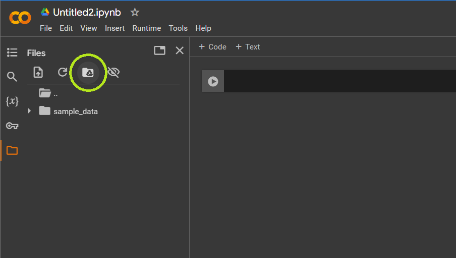
- Click the folder icon on the left side of the screen.
- Hover over the folder with the Google Drive icon; if it says “Mount Drive,” click it. If it says Unmount Drive, don't click it - that means that your Drive is already connected.
- Once your drive is mounted, click on your ”drive” folder to view its contents.
- Navigate to the location of the data file you want to analyze in Colab, right-click the file, and click “copy path.” You'll use this file path when you start importing your data.
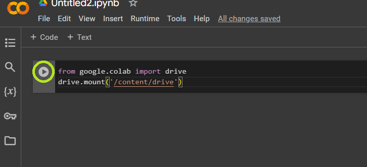
If that process doesn’t work, run the code below to allow access to your Drive. You can enter this code into a cell and click the play button on the left side of the cell.
from google.colab import drive
drive.mount('/content/drive')
Setting Up Your Data Project in Google Colab
Organizing your project code is a good practice to get into when you’re coding. For us, that means starting by thinking about all the necessary libraries we'll need for the project and importing them all in one block.
Some common libraries to include when setting up your project are:
| Library | Code | Description |
| Pandas | import pandas as pd | Pandas is a Python library used for working with datasets. You can use it to analyze a dataset. |
| Matplotlib | import matplotlib.pyplot as plt | Matplotlib is a library used for data visualization. You can use it to create graphs, charts, histograms, scatterplots, and other visuals. |
| Seaborn | import seaborn as sns | Seaborn is a data visualization library used for creating charts, graphs, and other visuals. |
| NumPy | import numpy as np | NumPy is a package used for more in-depth mathematics like matrix manipulation or working with arrays. If you’re doing any type of machine learning, you’ll most likely be using NumPy. |
Once you know which libraries you want to use, you can follow the steps below to bring in data and start your analysis.
RELATED POST: Using the Pandas Groupby Function with Python
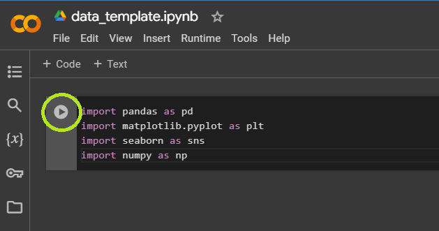
Step 1: Set Up Your Libraries
Enter your libraries into the first cell, then click the play button to the left of the cell to run your code. Note that running the code may take a few seconds.
Once you’ve run this initial code to install the libraries, you can use the libraries throughout your project.
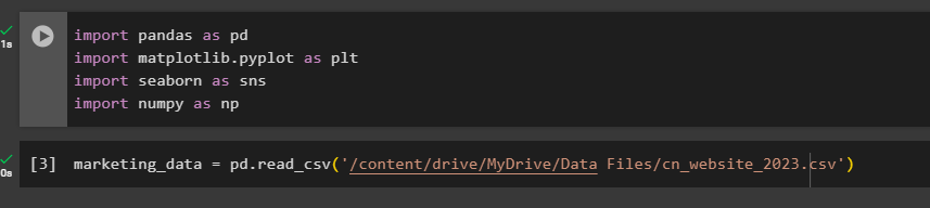
- import pandas as pd
- import matplotlib.pyplot as plt
- import seaborn as sns
- import numpy as np
Step 2: Import Data into Google Colab
There are more technical, robust techniques (like an API connection) but these are the two basic ways to import your data into Google Colab.
Method 1: Importing CSV or Excel files
If you use this method, you’ll first need to upload your data file to your Google Drive. You can copy the file path once you've connected your drive to Colab. You can use the following code in the steps below to connect to your data file. In this example, we’re connecting to a CSV file we uploaded to our Google Drive.
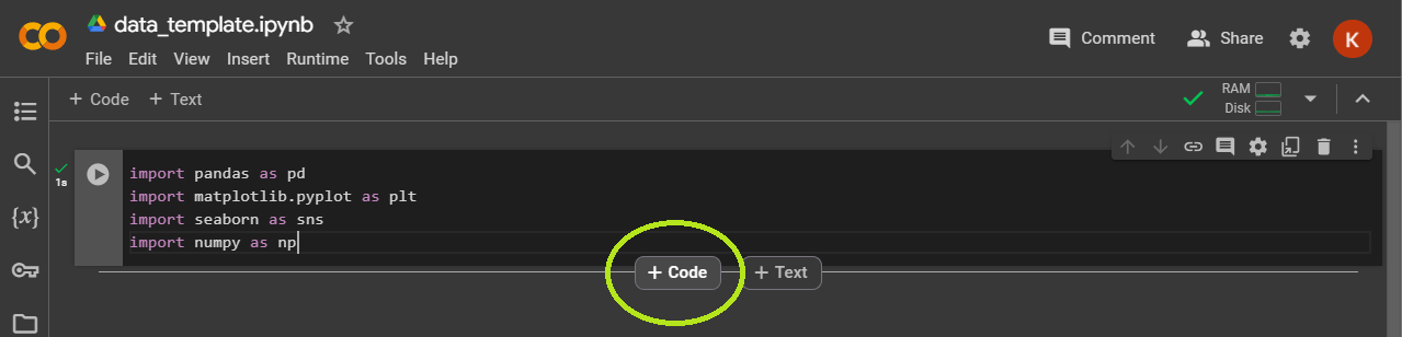
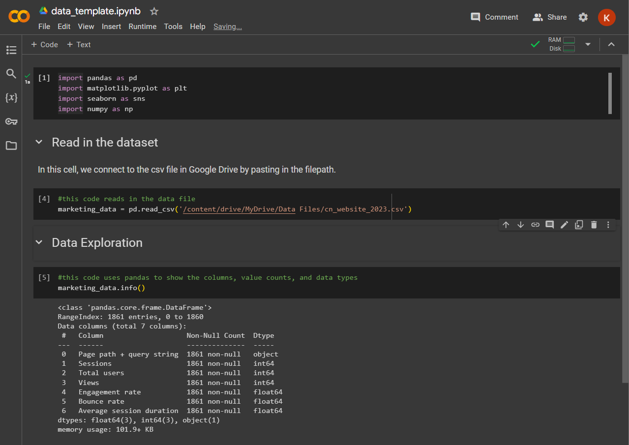
- Hover over the bottom of the first cell until the “+ Code” and “+ Text” buttons appear, then click “+ Code” to create a new cell.
- Next, we'll use pandas to bring our data file into our project as a data frame. Give your data frame a descriptive name. This is key when you work with multiple datasets at a time. The name we're giving our example data frame is ”marketing_data,” as seen in the screenshot below.
marketing_data = pd.read_csv('/content/drive/MyDrive/Data Files/marketing_data.csv')
- If you happen to be working with an Excel file, you can adjust your code to
df = pd.read_excel instead of pd.read_csv
Method 2: Connect Colab Directly to a Google Sheet
- You should use this method if you have a Google Sheet that is updated periodically. Create your Google Colab template code and then run it to pull the latest data from the connected Google Sheet.
- A few things to note: the Google Sheet must be in your Google Drive and you’ll need to install a couple more libraries to connect to your Google Sheet.
- The code below authenticates the Google user, then imports the “gspread” library so that you can interact with your Google sheet, and converts the data to a data frame.
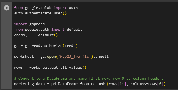
from google.colab import auth
auth.authenticate_user()
import gspread
from google.auth import default
creds, _ = default()
gc = gspread.authorize(creds)
worksheet = gc.open('file_name').sheet1
rows = worksheet.get_all_values()
df = pd.DataFrame.from_records(rows[1:], columns=rows[0])
Organization is the Key to Everything!
Now that you’ve connected your data to Colab, it’s time to get started with data analysis, right? Not so fast! We have a few more tips to impart to you, data friend.
We recommend setting up Text Blocks while you work on your project to keep yourself organized. Plus, if you hand off your code to a colleague, this will also ensure they can follow your steps.
RELATED POST: Using Python to Combine Datasets for Digital Marketing
To do this, hover over the area below your first cell. Buttons labeled “+ Code” and “+ Text” will pop up. Click “+ Text” to open up a WYSIWYG text box. Type in a title or section heading along with any further instructions or notes to keep your code clean and organized.
You can also add comments along with your code by inserting the hash sign (#) before a line of code.
Data Exploration Essentials
A good data scientist takes the time to understand their dataset before diving into analysis. What this means to us is to run a few simple lines of code to understand the makeup and distribution of data. We also want to know about the data types that make up the dataset, along with the number of rows and columns, plus other basic or good-to-know attributes like frequencies, counts, and simple statistics.
We’ll cover some of the basic codes and ideas to help you get an understanding of your dataset below. But first, we'll review some definitions that will help you get going.
Python Definitions to Help You Get Started Coding
If you're brand new to the world of coding - or need a refresher - here are some of the common key terms you'll run across when using Google Colab with Python.
- Data frame: A data frame is essentially a table consisting of columns and rows.
- Variable: A variable is a container for storing data values. We assign a variable to our dataset when we name it. We can call that variable throughout our code to reference the dataset. You can use almost anything as a variable, except for the “reserved words.”
- String: In programming language, strings are words, letters, or characters, like a website URL or a person’s name.
- Numbers: Python has three numeric types – int, float, and complex. You’ll most likely use int or floats when you’re conducting basic exploratory data analysis (EDA) in Python.
- Int, or Integer, is a whole number, positive or negative, without decimals.
- Floats are also referred to as “floating point numbers” that can be positive or negative and contain decimals.
- Function: Functions are code blocks that perform a specific task and only run when they’re called. Functions help to simplify code so if there is a task that we’re doing repeatedly, we can call the function instead of writing the same code again and again.
Exploratory Data Analysis (EDA) in Python Functions
| Action | Code |
| View the first five records of your dataset. To view more than five, add a number (we used 15) between the parentheses. | dataframe.head() dataframe.head(15) |
| View the last five records of your dataset. | dataframe.tail() |
| See the names, number of values, and data type of each column. | dataframe.info() |
| View basic statistics of your dataset including count, mean, standard deviation, and percentiles for each numerical column. | dataframe.describe() |
| View count, unique value count, top value, and frequency of values with the object data type. | dataframe.describe(include=’object’) |
| See how many records are null for each column of data. | dataframe.isnull().sum() |
| See the percentage of missing data in each column. | null_columns=dataframe.columns[dataframe.isnull().any()] dataframe[null_columns].isnull().sum()*100/len(dataframe) |
| View the basic statistics of a particular column in your dataset. | dataframe[‘column_name’].describe() |
| View the unique values in a particular column in your dataset. | dataframe[column_name].unique() |
Looking for a cheat sheet of Colab shortcuts? Download our free resource!
We’ve compiled some of our favorite shortcuts in this guide to help you create, modify, and navigate your code easily. Knowing these shortcuts can save you a lot of time and improve your overall experience using Colab.
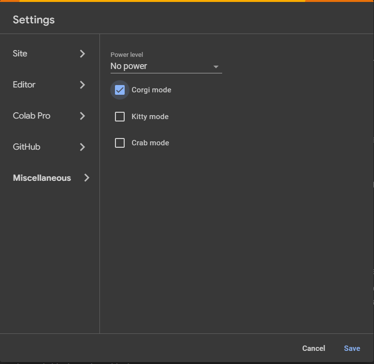
Non-Essential (But Still Fun) Set-Up Tip

If you want to add a bit of whimsy to your coding experience, turn on Corgi Mode (or Crab or Kitty Mode if corgis aren’t your style.)
Click the gear icon in the upper right corner of the interface, then click miscellaneous from the settings menu to view your Colab pet options. We’ll let you discover what happens when you activate corgi mode!
Simple Codes for Data Analysis in Google Colab
Now that you’ve got an understanding of the makeup of your dataset, you can start making decisions about how you’d like to view your data. For most datasets, that means looking at the data by date.
Sorting Your Data by Date
Depending on how your data comes into Colab, you may need to sort it. When making any changes to the dataset, it’s a good idea to save a copy of your original dataset. We do that below by assigning a new name, marketing_data_sorted, to our new dataset where we are sorting by date. In this case, we are sorting by ascending order, so our oldest records will be first.
marketing_data_sorted = marketing_data.sort_values(by='Date', ascending=True)

Adding Columns for Month, Season, and Day
If you have a date column in your dataset but want to look at seasonality or day of the week versus another variable, you can add new columns to your dataset.
RELATED POST: How to Remove Query Strings from URL Data Using Python
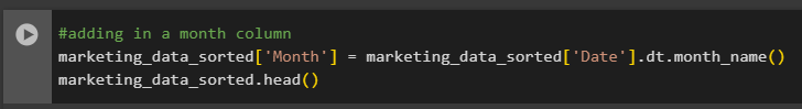
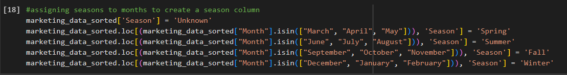
In the example below, we are taking our “Date” column and adding the month name to a new column called “Month.” Then we assign a season based on the month name.
marketing_data_sorted['Month'] = marketing_data_sorted['Date'].dt.month_name()
marketing_data_sorted['Season'] = 'Unknown'
marketing_data_sorted.loc[(marketing_data_sorted["Month"].isin(["March", "April", "May"])), 'Season'] = 'Spring'
marketing_data_sorted.loc[(marketing_data_sorted["Month"].isin(["June", "July", "August"])), 'Season'] = 'Summer'
marketing_data_sorted.loc[(marketing_data_sorted["Month"].isin(["September", "October", "November"])), 'Season'] = 'Fall'
marketing_data_sorted.loc[(marketing_data_sorted["Month"].isin(["December", "January", "February"])), 'Season'] = 'Winter'
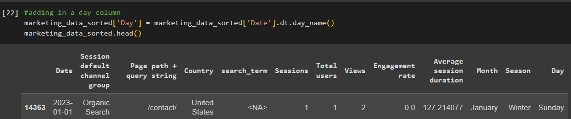
Lastly, we can add the day of the week as another column. You’ll notice that the new columns are now added to the data frame.
marketing_data_sorted['Day'] = marketing_data_sorted['Date'].dt.day_name()
marketing_data_sorted.head()
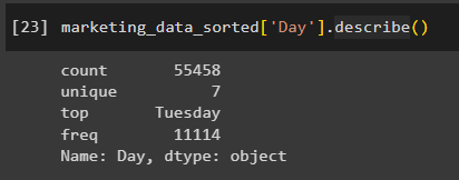
Now we can interact with these new columns just like any other column in the dataset. If we want to look at the statistics for the new “Day” column, we can use the following code:
marketing_data_sorted['Day'].describe()
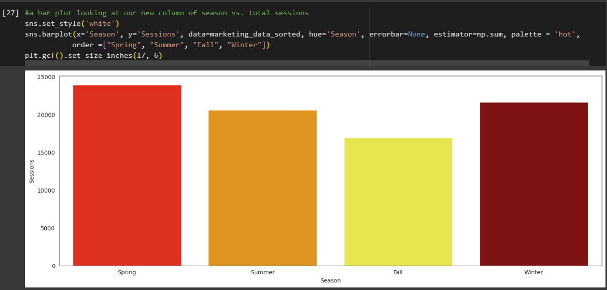
A Simple Visualization to Get You Started
We’ll go more in-depth into data cleaning and data visualization in future blogs. For now, we’ll leave you with a simple bar chart to get a glimpse of the seasonality of your dataset.
RELATED POST: Prepare Data for Analysis With Python [Jupyter Notebook Template]
In the code below, we’re taking our new “Season” column and creating a barplot using the Seaborn, NumPy, and Matplotlib libraries. This barplot is simply looking at the distribution of "Sessions" across the values in the “Season” column.
sns.set_style('white')
sns.barplot(x='Season', y='Sessions', data=marketing_data_sorted, hue='Season', errorbar=None, estimator=np.sum, palette = 'hot',
order =["Spring", "Summer", "Fall", "Winter"])
plt.gcf().set_size_inches(17, 6)
Can’t Wait for More Python Tutorials?
Check out some of our older posts all about using Jupyter Notebook and Python for data analysis and visualization.
If you want to learn more about data visualization using Seaborn, take a look at our article Exploring a New Dataset With Python Part II: Using Seaborn To Visualize Data.
Meet the Author

Kristen Nalewajek
Kristen is a Senior Data Analyst who joined Cypress North in May 2023 as an intern. She now works out of our Buffalo office, where she spends her days updating client dashboards, preparing analytic insights, and running queries to pull data from various sources.
Originally from Pennsylvania, Kristen brings more than 10 years of professional experience to our team. While her background is in higher education, Kristen decided on a career shift in 2022 and quit her job to go back to school full-time to study data science. Though she says it was scary and exciting to start over, Kristen is loving the data analytics field and has enjoyed learning new tools and techniques.
Kristen graduated from Buffalo State University in December 2023 with her master’s degree in data science and analytics. She previously earned a Bachelor of Arts in communication studies from Niagara University and a master’s degree in communication and leadership from Canisius University.
Some of Kristen’s previous experience includes instructional roles and working as a marketing communications coordinator. Most recently, she was a marketing professor for five years at Penn State Behrend in Erie.
When she’s not working, Kristen enjoys running and taking her dog Charlie for walks around Buffalo.
Related Resources

Is Your Digital Marketing Strategy Putting You at Risk? Understanding CCPA’s New Legal Precedent
Capital One’s privacy lawsuit highlights growing risks for marketers relying on standard tracking technologies. Here's what you need to know.

Using BigQuery to Overcome GA4 Data Retention Limits
Keep your GA4 data forever with BigQuery. Learn how to set up BigQuery to start storing raw GA4 data before it's gone for good.

Why US Businesses Need to Prioritize Data Privacy Now
The U.S. doesn't have a comprehensive national data privacy policy in place, but that doesn't mean businesses aren't being impacted. Learn more about the state-level policies reshaping digital marketing strategy and compliance.

How to Save Universal Analytics Data
All historical data from Google’s Universal Analytics will be deleted on July 1, 2024. Learn more about what your options are for backing it up before it’s gone for good.

Is Google Analytics 4 a Tactical Move Away From Free Analytics?
There’s something fishy going on with the way that Google is handling GA4. To me, it’s playing out as a backdoor cash grab, hidden under a thin veil of a free and easy migration from UA.

Data Lakes & Data Warehouses: What Are They? (& Why Your Company Probably Needs Both)
Data lakes and data warehouses have gained increased interest from organizations in recent years for their ability to support a single source of truth for data-driven decision-making across various departments. Understanding the strengths and applications of each is important not […]

How to Get Started with GA4: A Step-by-Step Guide
Need help setting up GA4 for your company or client’s website? Look no further! This post provides a step-by-step process for creating GA4 properties and best practices to make sure necessary events are tracked and the data flowing into GA4 are accurate.

How To Change Your Google Analytics Attribution Model in GA4
One of the biggest changes to Google Analytics has arrived in 2022 - the ability to change your Google Analytics attribution models. This is a first for Google Analytics as this attribution model change will not just apply to a […]
Why You Should Set Up Google Analytics 4 Today
Let's face it. GA4 isn't GR8. Google Analytics 4 is a work in progress to put it kindly. However, in these final weeks of 2021 you have an opportunity to get GA4 installed and tuned up, giving your future self […]

What to Include in a PPC Dashboard
Learn What Metrics to Include in PPC Reports. Then, Download Our Free Data Studio Dashboard Template! Let’s be real, pay per click advertising is all about data. What campaigns are bringing in the most revenue? What landing pages are converting […]

6 Google Ads Custom Columns to Help Uncover More Data
You may already know you can create custom columns in the Google Ads online interface. But, if you're anything like me, you may not always think about how you can leverage custom columns to surface essential Google Ads performance metrics, […]

How To See Audience Performace Across Campaigns With Google Ads Reports
Google Ads makes it really easy to see performance at the campaign or ad group level, but analyzing audience performance across multiple Google Ads campaigns is easier said than done. You're left wondering.... What's working well? What's not? Combining like-minded […]

Install Google Analytics on Web Stories With the Official WordPress Plugin
You read that right - the moment we've all been waiting for is here! Google’s Web Stories plugin is out of beta and now offers the ability to install Google Analytics on Web Stories directly in the plugin. If you […]
Cross-Domain Tracking With Google Tag Manager: A Simple Guide
Cross-domain tracking can make your life a lot simpler if you find yourself having to analyze Google Analytics data from two different sites. It allows you to capture the full user journey from the moment they land on one domain […]

Why Don't Multi-Channel Funnel Reports Match Up With Other Reports in Google Analytics?
Why don't numbers from the multi-channel funnel reports match up with numbers for the same metrics in other Google Analytics reports? The discrepancy is largely due to differences in what Google considers direct traffic. Read our guide to gain a full understanding of attribution differences in Google Analytics reporting.

Exploring a New Dataset With Python Part II: Using Seaborn To Visualize Data
Welcome to Part II of Exploring a new dataset with Python! If you missed Part I: The Basics, you can check it out here. In this article, we’ll be returning to our animal mug company’s dataset to continue our exploratory […]

Exploring a New Dataset With Python: Part I
We’re taking it back to the basics in this article. Why? The day of a Digital Marketer is busy. We’re pulled in all sorts of different directions and are responsible for a lot of different things. In my personal experience, […]

Strip Query Strings From URL Data: Python For Digital Marketing
If you’ve ever spent any time in a Google Analytics account, you’re all too familiar with the fact that the data isn’t always pretty. One exceptionally common scenario that us marketers run into all the time is page data being […]
Pandas Groupby Function: Python for Digital Marketing
If you’ve been following along with our Python for Digital Marketing posts, you’ve imported data from Google Analytics into a Jupyter Notebook and may have even combined it with another dataset. If you’ve never been here in your entire life […]

Using Python To Combine Datasets For Digital Marketing
Working in digital marketing, there are several reasons why you might want to combine two datasets from two different sources together. It could be combining Google Analytics data from two different accounts or properties, or turning two different reports into […]