How to Create a Looker Studio SEO Report Without Paid Connectors or Expensive Subscriptions

Effectively Measure Organic Traffic Performance With an Easy-To-Create Dashboard
Measuring organic traffic performance is a key part of SEO. But with so many different metrics available to track, it can be challenging to know what data to look at when measuring the impact of your SEO efforts.
Looker Studio (formerly known as Google Data Studio) is a free data visualization tool that allows you to build interactive dashboards predominantly for marketing reporting. It can be very helpful for analyzing organic traffic, rankings, and other key SEO data - and for communicating this data to others.
Once you learn the basics, building dashboards in Looker Studio is pretty straightforward. You can create some great user-friendly reports to measure leads from paid campaigns, organic search traffic, social media post performance, and more. Not all stakeholders have access to every platform, so it’s helpful to be able to pull all the data you need into one interactive dashboard for easy, self-serve access.
Looker Studio natively connects with Google products like Google Sheets, Google Ads, and Google Analytics. Third-party connectors can also be used to connect to other platforms like Facebook, HubSpot, etc.
Connecting to third-party data sources is easy if you have the right tools, but if you or your client do not have access to a paid data connector service like Supermetrics or Funnel.io, it can be challenging to pull all the metrics you want to see into your dashboard.
Additionally, if you use third-party data tools like Semrush or Ahrefs, not all pricing tiers allow you to connect directly to Looker Studio. For Semrush specifically, you cannot connect your data unless you subscribe to the Guru plan or a higher tier. Ahrefs includes Looker Studio integration with an Advanced subscription or higher.
In this post, I’ll show you how to create a simple Looker Studio report using native connectors and Google Sheets to connect to Google Search Console, Google Analytics 4, and Semrush.
Keep in mind, your SEO reports and dashboards should always be tailored to your specific organic goals. If you’re following along, feel free to adjust your dashboard to better align with the metrics you want to measure.
Getting Started
The sample Looker Studio dashboard I’m building for this post will use the native Google Analytics 4 (GA4) and Google Search Console (GSC) connectors, and pull Semrush data into Looker Studio from a Google Sheet. For reference, I’ll be exporting Semrush data from a Pro plan.
Before I build this dashboard, I also need to identify what it is I want to measure based on our organic goals.
For this basic dashboard, I’ll be reporting on the Cypress North blog. We want our blog posts to be helpful and engaging resources for digital marketers, and our goal is to increase form submissions that can be attributed to our blog. Based on the above, I want to measure:
From GA4:
- Organic sessions to the blog
- Search engines driving the most traffic to the blog
- Organic traffic by device type
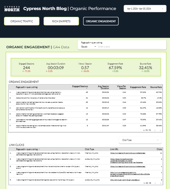
- Organic time on page, pages viewed per session, engagement rate, and bounce rate
- Organic link clicks
- Organic conversions - for us this would be contact form submissions and download form submissions
From Google Search Console (GSC):
- Overall clicks/impressions/CTR/average position of our blog
- Average position for each of our blog posts
- Queries driving traffic to our blog posts
From Semrush:
- Rich snippets
Since the purpose of this report is to measure organic traffic specifically, I want to make sure all GA4 data is filtered by session medium = organic. I’m also only looking at the Cypress North blog, not the entire site, so I set up a regex filter to only include blog URLs.
Looker Studio Basic Set-Up & Google Analytics 4 Connection
To get started, I go into Looker Studio and select “Blank Report.”
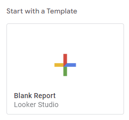
If you've never used Looker Studio, you can learn more about the fundamentals here.
Next, I’ll be prompted to add our data sources. Let’s add Google Analytics first.

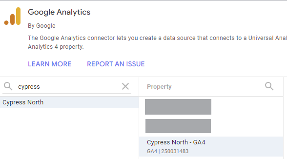
Now that I’ve connected to the right GA4 property, it’s time to start pulling in our data. I’m not going to format anything yet or style the report, just pull in the metrics identified above and add filters to each. If you’re new to Looker Studio, I’ll show you how we set up a few of the different chart types below.
Organic Sessions - Scorecard
I wanted to see overall organic sessions on our blog, so I decided to use a scorecard chart to showcase this data. I changed the metric to “Sessions” in the Setup menu on the right-hand side, then added our pre-made organic traffic and blog post URL filters.
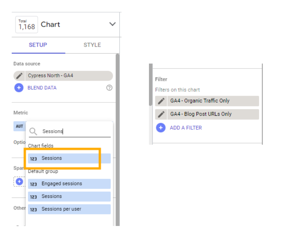
To stay organized, I like to label all my filters the same way so they’re easy to find. All my filters start with the data source, followed by the hyphen and what it is I’m filtering by. For example, in the screenshot above I labeled my blog post URL filter “GA4 - Blog Post URLs Only”.
Lastly, I’m going to rename my metric from “Sessions” to “Organic Sessions” for further clarity using the pencil icon to the left of my metric.
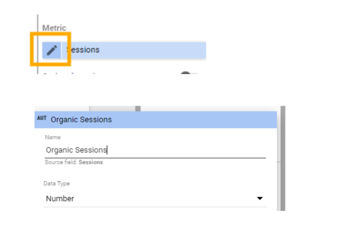
Now we have our scorecard!

Organic Traffic by Device - Donut Chart
To pull organic traffic by device, I selected a Donut Chart. From here, I need to choose a dimension (“Device Category”) but will keep the Metric as “Sessions” and add our filters. Now we have our unformatted donut chart!
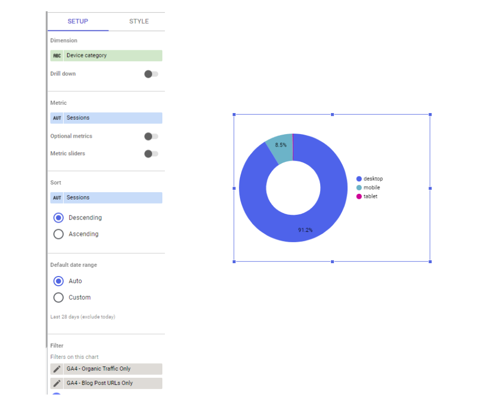
I then went ahead and added the rest of my GA4 charts, tables, and scorecards.
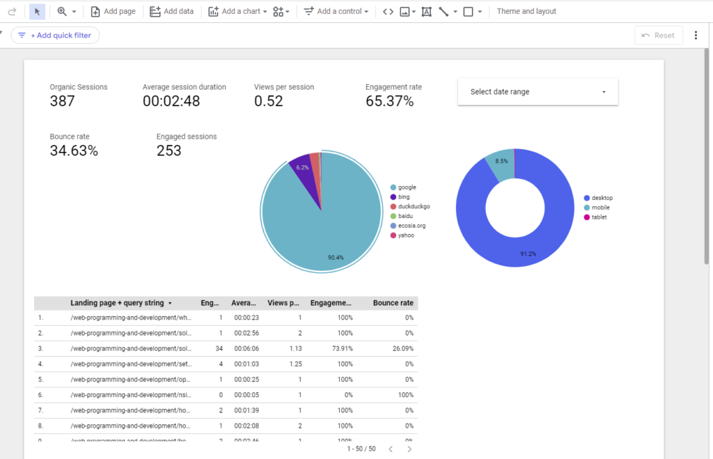
Pulling Google Organic Search Data from Google Search Console
Next, I want to pull click, impression, CTR, and average position data for our blog on Google from Google Search Console so I’ll add that data source.
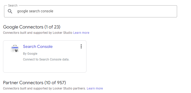
The native Google Search Console connector lets you pull data in two ways: Site Impression or URL Impression. For one search query, URL impression counts each instance of a page from your site in the SERPs individually, but site impression only counts data for your site as a whole.
For example, if three Cypress North blog posts ranked for one query (ahh cannibalization😵💫), Site Impression would only count one impression for that search. URL Impression would count three impressions for each Cypress North URL shown.
For my dashboard, I'll use URL Impression data because I'm measuring clicks, impressions, etc. for each individual blog post.
"We recommend using URL-level tracking for most visuals. If you'd like to be able to filter your visuals by a particular page, the URL-level data source will allow you to do that. You cannot filter by page when using the site-level data source." - Kristen Nalewajek, Jr. Data Analyst
Clicks, Impressions, etc. by Landing Page - Table
To view Google organic search data by blog post, I’m going to create a table. By default, Looker Studio gives me the table shown below. To customize it, I’ll change the dimension from Google Property to Landing Page and add Impressions, URL CTR, and Average Position as additional metrics.
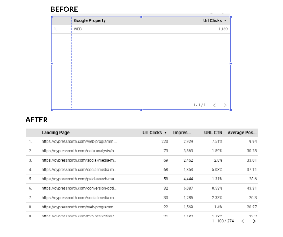
I also created a new blog post URL filter for Google Search Console and added that to the table as well to make sure I’m only seeing data for our blog.
Now we have our unformatted table!
We have a lot of blog posts, so I also want to include a filter to make the table easier to use. Looker Studio provides a lot of different filter options, but the one that makes the most sense for this particular dashboard is the “advanced filter.” This lets the user filter the table by landing page, or multiple landing pages, and allows for regex for more advanced filtering.
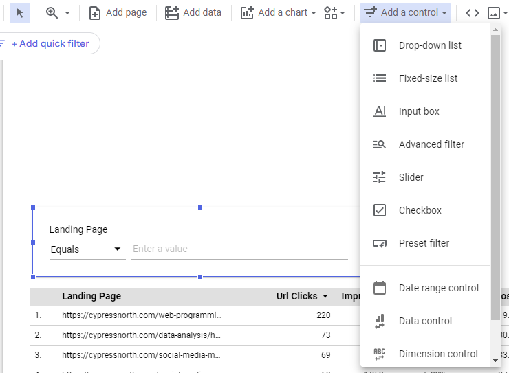
Now that we have our table, I'm going to move on to our last data source - Semrush!
Pulling Our Semrush Data into Looker Studio
As mentioned above, Semrush can integrate with Looker Studio if you have the Guru plan or higher. The account I’ll be using for our Cypress North blog is at the Pro tier, so it doesn’t include Looker Studio integration.
If all stakeholders have access to Semrush, it may not be necessary to include this information in a Looker Studio report. If not, including this data in your dashboard can help you provide a more holistic view of your organic performance.
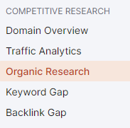
For our purposes, I want to report on the number of rich snippets we have on our blog - specifically Featured Snippets, People Also Ask, Knowledge Panels, and eventually AI-Generated Answers. (At the time of this post Semrush is only reporting on AI-Generated answers in Position Tracking). I will be pulling this data from the Organic Research tab in Semrush.
The first step before pulling any of this data is to format my Google Sheet. At the top of my sheet, I’m including columns for:
- Month Text
- Month (in date format)
- Year
- Featured Snippet count
- People Also Ask count
- Knowledge Panel count
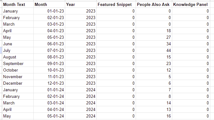
Month Text isn’t really necessary for my Looker Studio reports to function, I just like including it to make it easier to view the Google Sheet.
Now that my sheet is formatted, I manually pulled the number of Featured Snippets, People Also Ask answers, and Knowledge Panel results from the SERP Features Trend chart:

Once all my data has been manually added, it’s time to connect my Google Sheet to Looker Studio by following some of the same steps as above when we connected Google Analytics and Google Search Console.
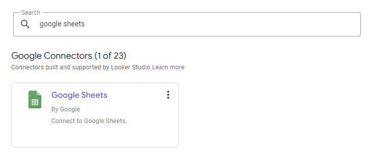

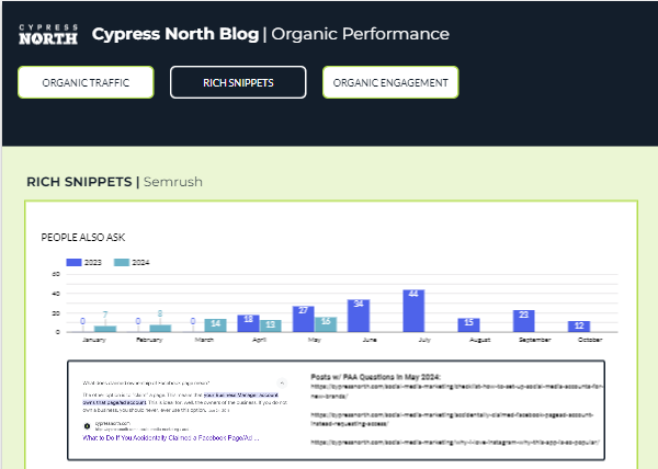
Using this data source, I want to create a bar chart for each snippet type similar to what’s already in Semrush to better display this information.
People Also Ask - Bar Chart
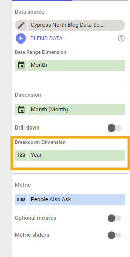
Once my data source was all set, I selected a basic column chart to start pulling this information in. I’m adding “People Also Ask” as my metric, “Month” as my dimension (not “Month Text,”) and “Year” as my breakdown dimension.
Note that if you try to add multiple metrics to one column chart, you cannot add a breakdown dimension to that chart.
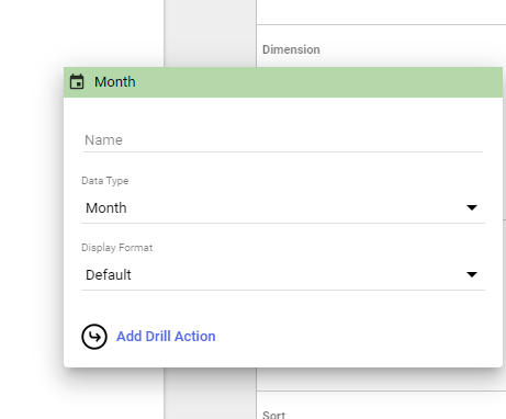
Under Dimension next to “Month,” I clicked on the little calendar symbol, then selected Data Type = Month to make sure Looker Studio organizes my data by month and not each individual date.
Now I want to change my sort to “Month” by Ascending, and make my secondary sort “Year” by Ascending. That gives me my unformatted bar chart! I’ll repeat this for the other rich snippet types I’d like to showcase.

Styling Our Report, Testing Report Filters, and Double-Checking Our Numbers
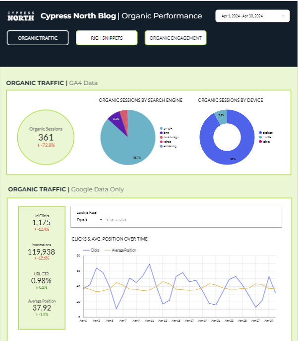
Now that I have all my charts, tables, and scorecards (oh my!) it's time to format the report to match our Cypress North brand, and add a filter for date as well as buttons to make the report easier to navigate.
I’ll also double-check that all filters work as expected, and spot-check some of my tables and charts to make sure the numbers match what’s being recorded in the original data sources (GA4, Google Search Console, etc.)
These checks are really important to perform before you hand the dashboard off to stakeholders. If you have an incorrect data filter or used the wrong dimension, double-checking your numbers will help you catch it.
Measuring organic traffic performance can be challenging, but I hope this blog post makes it easier.
If you need assistance with your SEO strategy or reporting, get in touch with us!
For reporting help or assistance building advanced dashboards in Looker Studio, Power BI, or another data visualization tool, reach out to the experts in our data department.
Meet the Author

Kathleen Hagelberger
Kathleen is our Director of Organic. She joined Cypress North in July 2019 and works out of our Buffalo office. Known by coworkers and clients alike as Kbergs, Kathleen is an SEO specialist who brings more than four years of experience to our digital marketing team. Some of her daily responsibilities include monitoring organic traffic for clients and reporting on what she finds, putting together site plans, helping with new site launches, project management, and other SEO projects. She also makes occasional guest host appearances on our Marketing O’Clock podcast.
Before joining Cypress North, Kathleen gained professional experience through internships with Genesee Regional Bank and TJX Companies, Inc. She has earned her Google UX Design certificate, Google Analytics 4 certification, and HubSpot Content Marketing certification.
Originally from Attica, Kathleen graduated from the Rochester Institute of Technology with bachelor's degrees in new media marketing and management information systems.
Outside of work, Kathleen is on the volunteer committee for Erie County's Walk to End Alzheimer's chapter. She also serves as the Vice President of Public Relations for one of the Buffalo chapters of Toastmasters.
In her downtime, Kathleen enjoys taking dance classes like tap and jazz and fitness classes in general. She also likes going to the beach, trying new restaurants, reading, watching 80s movies, and Marie Kondo-ing her apartment.


