Testing Website Accessibility: Five Testing Tools & Methods To Identify Accessibility Issues


Is your site compatible with website accessibility guidelines? Use these tools to benchmark and identify improvement opportunities.
Website accessibility is often overlooked, but it shouldn’t be. According to CDC estimates, 61 million adults in the United States alone live with some sort of disability - that’s larger than the population of the states of New York (19.45 million) and California (39.51 million) combined.
When we optimize our sites for accessibility, not only are we ensuring that users with disabilities can read and interact with our content, but we’re also indirectly helping all site users by improving the functionality of our sites. Think of the curb-cut effect, or the idea that an improvement in usability for one group ends up benefiting everyone else.
For example, when we improve the color contrast of elements on our site we make it easier for users with visual impairments to view content on the screen. Not only will this design change improve the experience for this user group, but it will likely reduce eye fatigue for other users without visual impairments.
Website accessibility can indirectly have SEO benefits as well. While accessibility isn’t a ranking factor, taking actions like adding alt text to images can help them show in Google Images for relevant queries, which ultimately drives more traffic to the website.
In this blog post, we used tools to check on the accessibility of our own podcast site. When we create new web experiences for our clients, we always cover accessibility requirements in great detail so they know exactly what level of compliance they'll have. However, with some of our internal projects, we tend to launch with a Minimum Viable Product (MVP) mentality so we don't let perfection get in the way of progress. As our Marketing O'Clock show is becoming more and more popular, now is a great time to showcase accessibility improvement on our own domain throughout this post.
These tools will also help us as we redesign and rebuild the Cypress North website. When we relaunch in 2022, creating an accessible website will be a top priority.
Checking for Sufficient Color Contrast
The first tool we’ll be discussing can be used to examine design elements on a site for good color contrast. It’s typically best to do this before a new site or site redesign is launched to ensure that the new designs are easy to see on the screen - and to give yourself an opportunity to fix the designs before they are made final.
A site with poor color contrast can be difficult for users with visual impairments to interact with and read, although users without visual impairments can also find it difficult to read content depending on the colors chosen in a design. The screenshot below is one such example.

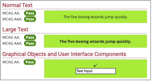
The WebAIM Contrast Checker is an excellent tool that can be used to check contrast ratios and ensure that you pass WCAG (Web Content Accessibility Guidelines) for color contrast at both AA and AAA levels of compliance. WCAG are international standards developed by the World Wide Web Consortium to ensure basic levels of web accessibility for users with disabilities. Level AA is the middle tier of compliance, while Level AAA is considered the highest level of accessibility. Most sites aim to pass WCAG Level AA.
In order to pass WCAG level AA, your designs must have a color contrast ratio of 4.5:1 for normal text, or 3:1 for large text. WCAG level AAA standards are higher, normal text must have a color contrast ratio of 7:1 for normal text or 4.5:1 for large text. The color contrast ratio for Screenshot 1 above is 2.3:1, a failing score for both WCAG levels.
Now that we know what color contrast ratios to strive for, we can begin our test. For the purposes of this blog post, I will be testing all tools discussed on the Marketing O’Clock site.
To use the WebAIM Contrast Checker, first enter the foreground color of your site’s design into the “Foreground Color” box. For the Marketing O’Clock site, I want to test the font color against the green background on the homepage. The font color is charcoal (#1f282f), so I’ll enter the hex code into the “Foreground Color” box. Next, I’ll add the green background color (#8de600) to the “Background Color” box and hit enter to calculate my contrast ratio.
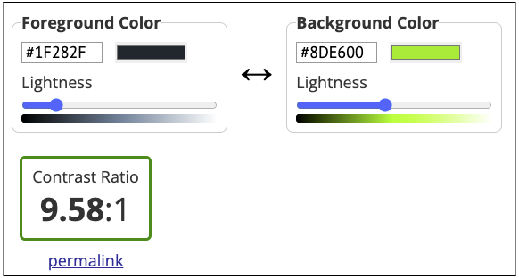
As you can see in the screenshot above, our design color combination passed with a contrast ratio of 9.58:1. Once you’ve generated your contrast ratio, you can generate a permalink to link back to the page with your color inputs which is pretty handy for sharing. Check out the Marketing O’Clock permalink here.
Beneath the contrast ratio, the WebAIM Contrast Checker also gives examples of how your background and foreground colors look together, and specifics on which levels of WCAG you’ve passed.
The WAVE tool, also from WebAIM, is another option for testing color contrast (among other accessibility requirements). To use this tool, insert your website URL into the “Web page address:” box at the top of the page and hit enter (I’ll be testing the Marketing O’Clock site again as an example).
After running, the results show that our site has one contrast error.
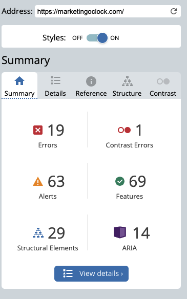
To view specific details about the error and where it’s located, I can click the “View details” button at the bottom. It looks like the tool identified this image as having poor color contrast:
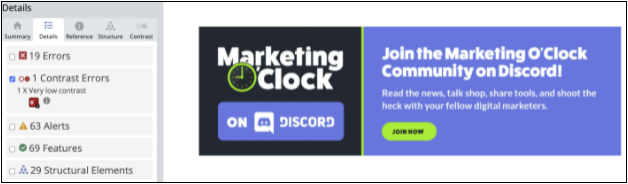
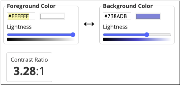
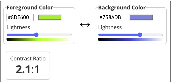
Upon further inspection, I tested the background color (Discord blue, #738adb) against both white for the text (foreground) and green (#8de600 - foreground) for the button using the Contrast Checker tool. White text on the blue background passed WCAG AA for large text, the smaller text should be changed to make it easier to read. The green button against the blue background did not pass any WCAG standard and should also be updated. To the left of the image, Discord blue against the charcoal background did pass with a color contrast ratio of 4.55:1.
Coblis Color Blindness Tool
Certain color combinations used in graphics or on a website can also be difficult to view for users with color blindness. According to the National Eye Institute, difficulty distinguishing between the colors red and green is the most common form of color blindness - although another common type makes it difficult to tell the difference between yellow and blue.
To determine how your website design or graphics look to users with different forms of color blindness, you can use the Coblis Color Blindness Simulator developed by Matthew Wickline and the Human-Computer Interaction Resource Network. Users simply need to select the file they want to test, upload it, and use the different views to see how their design or graphic looks to users with different types of color blindness.
As an example, I will test the Discord graphic tested above in the Coblis tool.
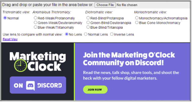
In the screenshot above, the Discord graphic has been added to the Coblis tool.
First, we can check to see how our graphic will look for users with Red-Weak/Protanomaly color blindness.
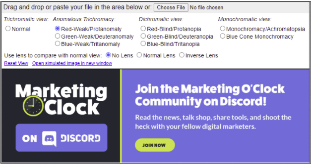
It looks like this image is visible for users with Red-Weak/Protanomaly color blindness - the green colors just aren’t as vibrant. The same can be said for Green-Weak/Deuteranomaly color blindness.
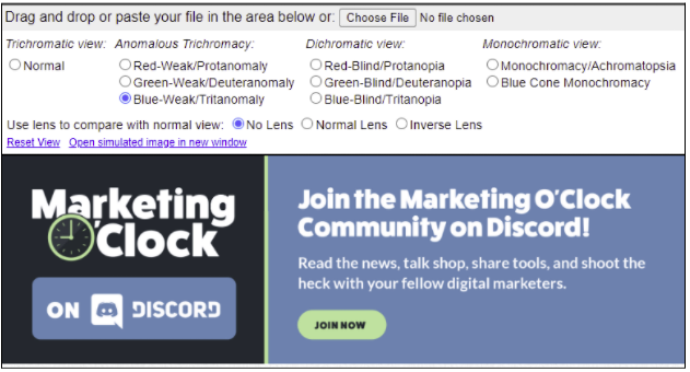
However, when we select Blue-Weak/Tritanomaly the colors blue and green are muted when compared to the original image.
Distinct color differences can also be seen when Blue-Blind/Tritanopia, Monochromacy/Achromatopsia, and Blue Cone Monochromacy color blindness types are selected.
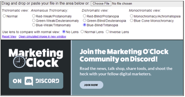
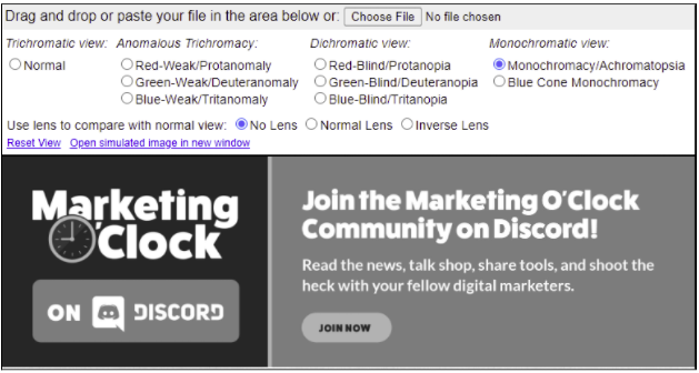
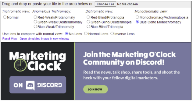
Despite the differences in color, this graphic is still legible for the types of color blindness tested in this analysis. No action is needed here.
Compatibility with Screen Readers
When doing a major site overhaul or before launching a new site, it’s important to ensure that the content is accessible to screen readers. Screen readers are a form of assistive technology used to read web content outloud to users with visual impairments or other disabilities so that they can access and interact with content online. Some screen readers will also convert web content into a braille display.
The best way to test for screen reader compatibility is to actually use a screen reader to access content on your site. There are many different types of screen readers available, but according to WebAIM, the most commonly used screen readers are JAWS and NVDA. JAWS is not free (a home license alone costs $1,000 USD), but NVDA is free to download - however a Windows operating system is required. For Mac users, the VoiceOver screen reader comes with any Mac or iOS operating system free of charge.
Since I have a Mac, I will be using VoiceOver to test the Marketing O’Clock website.
Keep in mind (and this is very important), if you have never used a screen reader before you will need to learn how to navigate and interact with the screen reader in order to get anything valuable out of your test. It’s easy to assume your site isn’t compatible with the screen reader if you have no idea what you’re doing or how to get around.
Fortunately, VoiceOver provides a helpful tutorial when the user launches it for the first time (launch VoiceOver using command F5, then hit the spacebar). There are also plenty of great resources available online to learn from, including:
- Testing with Screen Readers from WebAIM
- Learning VoiceOver Basics from Apple
- VoiceOver Commands and Gestures from Apple
- This YouTube video - VoiceOver screen-reader on the Mac - Getting Started [Part 1] from the channel Blind Insider
Another important thing to note, many keyboard shortcuts will start with VO keys. On Mac, the default VO keys are the control option buttons (held down simultaneously), or the caps lock button.
As I navigated through the Marketing O’Clock website, I used the following commands:
- VO - left/right arrow keys to navigate through the different web elements
- VO - U to get to the web item rotor - this provides a list of headers and links that you can navigate to directly instead of using the arrow keys to navigate all the way down a page
- VO - space to select elements (like links or checkboxes)
- VO - Z to repeat the last phrase spoken
- VO - H for help
- VO - A to get VoiceOver to continuously read from the cursor to the end of the text
Once I launched VoiceOver and navigated to the Marketing O’Clock page, I noticed pretty quickly that the Contact link in the main navigation bar doesn’t respond when clicked (VO - space). The mobile version of the navigation also appears to be accessible via screen reader since the screen reader is reading out the menu options twice which is pretty repetitive. Without using a screen reader, the mobile menu is not available on desktop and cannot be clicked. We will need to work with a developer to get this fixed.
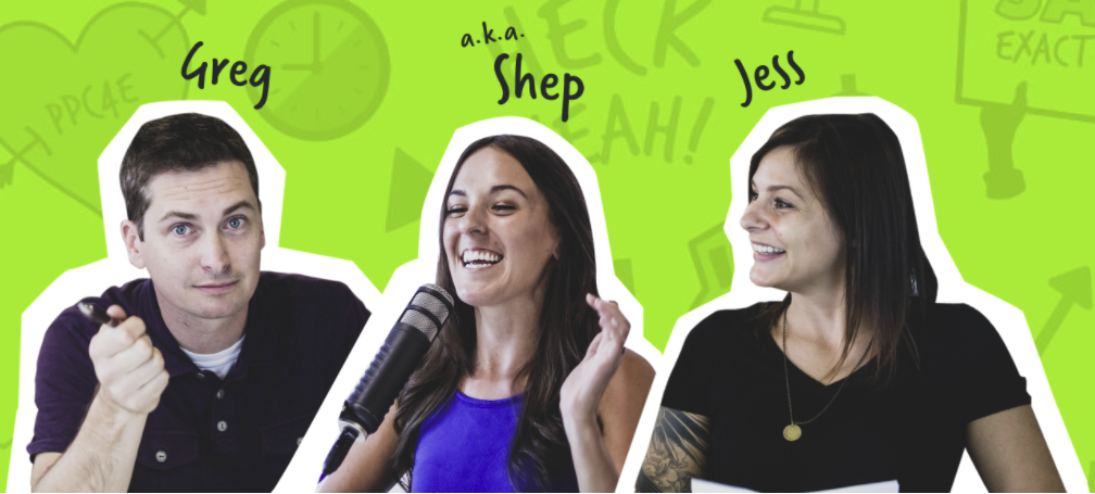
After moving past the navigation bar, I noticed that this header image of Greg, Shep, and Jess has outdated alt text.
This image of the hosts located towards the bottom of the homepage is also missing alt text.

Social links in the footer don’t have descriptive text, so the screen reader is just reading them as “link” which is not very helpful. The badges located at the bottom of the footer are missing alt text, so each reads as “Client Partners Verified”.
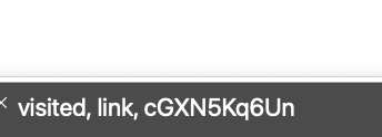
The Discord CTA I’ve referenced above is also missing link text on some episode pages (like this page for Episode 211). It reads as “cGXN5Kq6Un” which is not descriptive at all and needs to be fixed.
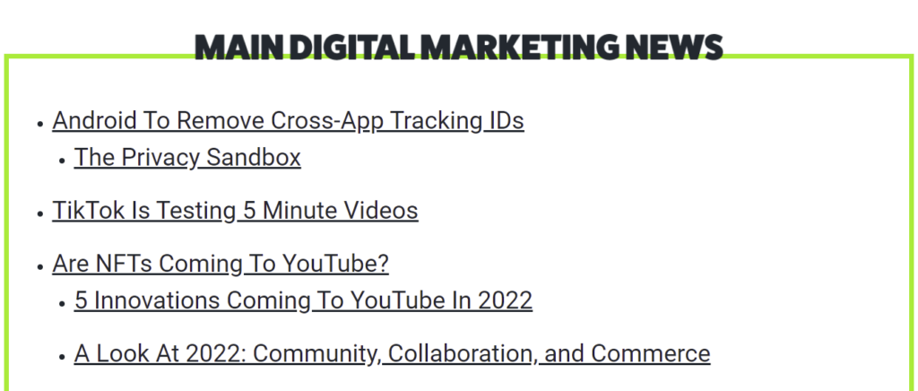
Finally, I discovered that this image (which looks like text) says “Main Digital Marketing News” but the screen reader reads it as “MOC main image”. This does not properly communicate the meaning of this section and needs to be updated.
The Marketing O’Clock website has tweets embedded on all episode pages, and I did not know prior to running this test that screen readers could read embedded tweets, so that was exciting to learn!
Overall, we can avoid most screen reader issues by following WCAG best practices. This includes adding alt text to images and creating descriptive links. Without testing the site with a screen reader, it may have taken us a long time to uncover these findings on the Marketing O’Clock website. Fortunately, we were quickly able to identify several improvement opportunities with this exercise and add them to the development queue.
Testing Keyboard Accessibility
Some users rely on keyboard navigation instead of a computer mouse to get around the web. This may be due to a permanent disability, such as losing the use of one or both hands. Some users may also choose to navigate using the keyboard if they have a temporary injury, such as a broken wrist, or if they are multitasking and are looking to move through an element like a form quicker without the use of a mouse.
Keyboard navigation is primarily done using the tab key, although there are other keyboard strokes that allow users to move through a webpage.
The most common ones include:
- Navigating to different elements using the tab key (tabindex), or shift + tab to move backwards
- Clicking the enter key to activate a link on a page
- Clicking either the enter key or the spacebar to activate a button
- To scroll, use the up/down arrow keys to move vertically or the left/right arrow keys to move horizontally
- To use a dropdown menu, use up/down arrow keys to move between options, and the spacebar to expand the full menu
For more interactions, visit this helpful article on Keyword Accessibility from WebAIM.
To see if your website is accessible without a mouse, navigate to the homepage and see how quickly and easily you can move around using only the tab key, enter key, spacebar, and arrow keys for scrolling. Are you able to fill out a form? How about watching a video?
On the Marketing O’Clock website in Google Chrome, I started out on the homepage and attempted to move to the episodes page to listen to the latest episode. I started tabbing through the homepage, and it started out pretty well. I could see the focus indicator clearly in the navigation bar and was able to hit enter to get to the Episodes page.

On the Episodes page, I used the arrow keys to scroll down the page then I attempted to use the tab keys to get to Episode 207 - the most recent podcast episode at the time this was written. Once past the navigation bar, the focus indicator gets pretty difficult to find with the color contrast on the site. I eventually found it again around the show notes link.
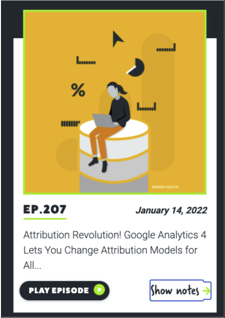
On the episode page, I used the arrows to scroll to the image with the play button and attempted to tab my way over to it. I was able to eventually get the episode to play, but as you can see in the screenshot below - the focus indicator is not visible so I really had to do a lot of guesswork to get where I wanted to go.

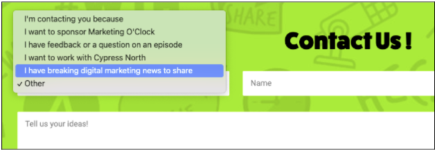
Now I’ll test the contact form on the Marketing O’Clock website to see if I can submit it without using the computer mouse.
Starting once again from the homepage, I tabbed my way over to Contact in the navigation bar at the top - but the link didn’t work (just as it didn’t during the VoiceOver test above)!
I ended up scrolling to the bottom of the page instead to get to the contact form. Once there I attempted to make a selection from the dropdown first and was able to submit the form successfully.
Although this test was brief and only tested on one browser - I came away with some important learnings. The first is that the Contact link in the navigation does not work without the mouse click (just as it didn’t when using VoiceOver). I also realized that the focus indicator is pretty difficult to see on certain page elements. Although the browser provides a focus indicator automatically, it can be adjusted in the CSS file to better match a site’s design and provide better color contrast.
Captioning
Finally, for any videos or audio content, providing captions ensures that even without sound users understand what’s being said. This benefits users with hearing impairments, and hearing users who are unable to use sound on their devices for whatever reason. If you have a multi-national or international audience, adding captions in multiple languages ensures that your content is accessible to a wider audience.
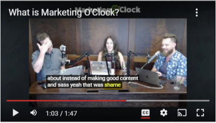
While some video platforms (like YouTube) provide auto generated captions, these are not always the most reliable. For example, in this teaser video on the Marketing O’Clock YouTube channel our former co-host Mark said “yeah that was shade”, but YouTube captured it as “yeah that was shame”. Not the same meaning.
For teams with limited resources, auto generated captions are sometimes the only viable option for long form content (like hour-long podcast episodes). Even so, it’s still important to double check that these captions are accurately portraying what’s being said and make any fixes to incorrect captions.
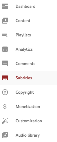
Fortunately, I can make changes to this video’s captions directly in YouTube without completely rewriting what’s already there. To do this, I need to login to YouTube Studio and navigate to “Subtitles” on the left hand side of the screen.
From here, I want to edit the automatic captions YouTube already created, so I can click the “Duplicate and Edit” button next to the original captions. Now I can edit the captions as text, and find the errors to correct them.
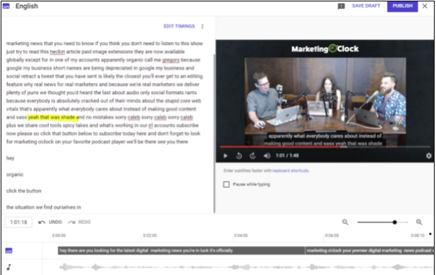
Once I finished with the above steps, I clicked Publish to push the changes live, then I rewatched the video to make sure the changes went through and everything looked correct.
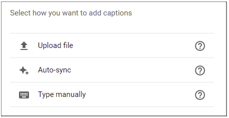
If I wanted to manually override the auto generated captions from YouTube and write my own, I could use the “Type Manually” option in Studio’s subtitle editor to write up my captions as I watch the video in real time. I could also upload a file of my captions from another subtitle editor. YouTube supports a variety of formats, including .srt and .sbv - you can view a complete list here.
If you are using a platform outside of YouTube to host your videos, or if you don’t want to use YouTube’s manual captioning option, you can also use Amara - a subtitling editor service. Amara does have a free plan, but the free plan is also public which means that other users have access to your videos and can edit your subtitles without your permission. There are multiple paid plans to choose from if you’re looking for a private option!
Conclusion
We hope that we’ve emphasized the importance of accessibility in this post, and that you find the tools discussed above to be helpful. As we’ve shown, testing a site for accessibility often uncovers additional improvement opportunities that benefit all users. Whether you're starting the process of creating a new website or updating an existing one, we hope that you always remember to keep accessibility in mind.
If you need assistance with website development, audits, design, or marketing the Cypress North team is here to help! Get in touch with us or continue reading to discover more helpful resources.
Meet the Author

Kathleen Hagelberger
Kathleen is our Director of Organic. She joined Cypress North in July 2019 and works out of our Buffalo office. Known by coworkers and clients alike as Kbergs, Kathleen is an SEO specialist who brings more than four years of experience to our digital marketing team. Some of her daily responsibilities include monitoring organic traffic for clients and reporting on what she finds, putting together site plans, helping with new site launches, project management, and other SEO projects. She also makes occasional guest host appearances on our Marketing O’Clock podcast.
Before joining Cypress North, Kathleen gained professional experience through internships with Genesee Regional Bank and TJX Companies, Inc. She has earned her Google UX Design certificate, Google Analytics 4 certification, and HubSpot Content Marketing certification.
Originally from Attica, Kathleen graduated from the Rochester Institute of Technology with bachelor's degrees in new media marketing and management information systems.
Outside of work, Kathleen is on the volunteer committee for Erie County's Walk to End Alzheimer's chapter. She also serves as the Vice President of Public Relations for one of the Buffalo chapters of Toastmasters.
In her downtime, Kathleen enjoys taking dance classes like tap and jazz and fitness classes in general. She also likes going to the beach, trying new restaurants, reading, watching 80s movies, and Marie Kondo-ing her apartment.
Related Resources
5 Methods to View a Page as Googlebot
Can search engine crawlers access your content? If you’re not sure, check out these five methods to view your pages as Googlebot and other crawlers.

3 Options for Multilingual Website Translation
Managing multilingual web content is challenging, and there are plenty of options available. Learn more about the solutions and how to find the right one for you.
Google Launches AI Mode: What it Means for the Future of Search
Google’s new AI Mode marks a major shift in its search strategy. Here’s how we expect it to transform the user experience and future of search.

13 Digital Marketing Predictions for 2025
Top Industry Voices Share Their 2025 Digital Marketing Trend Predictions As digital marketers, we know a new year brings new goals, new opportunities for growth, and new challenges. But a new year also brings plenty of change. Whether it’s advancements […]

Let's Put a Stop to Google Page Annotations
Google's Page Annotations will direct some visitors away from sites and back to search. We’re calling for an end to this practice.

Choosing the Right Digital Marketing Career Path as a New Marketer
Learn more about the different career opportunities in digital marketing by exploring the roles of SEO and PPC specialists. Gain insights into key skills, tools, and strategies to help you determine the best path for your professional career.

6 SEO Tips & Tricks We Learned at WTSFest 2024 in Philadelphia
Three of our digital marketers recently picked up some new tips, tricks, and best practices at the 2024 Women in Tech SEO Festival. Learn more about what we learned and how we’re applying it to our work.

How to Create a Looker Studio SEO Report Without Paid Connectors or Expensive Subscriptions
Effectively Measure Organic Traffic Performance With an Easy-To-Create Dashboard Measuring organic traffic performance is a key part of SEO. But with so many different metrics available to track, it can be challenging to know what data to look at when […]

23 Of The Best Resources For Starting A Digital Marketing Career
The best social media communities, podcasts, newsletters, and certifications for new digital marketers I didn’t know anything about digital marketing when I started as an intern at Cypress North earlier this year. Acronyms like SEO, CPA, and ROAS meant nothing […]

A Marketer’s Website Launch Checklist
SEO, Google Tag Manager Tracking, & Content Planning for a New Website There’s nothing quite like launching a beautiful, brand new website, but it is something that can have ugly consequences if not performed correctly. While marketers aren’t typically responsible […]

SEO for PDFs - How To Optimize PDFs For The Web
Let’s face it, for some companies Portable Document Formats (PDFs) are an unfortunate necessity. From sell sheets and downloadable product flyers, to manuals and tutorials - PDFs have secured a spot in our lives, and there are some tips and […]

Updated: How To Exclude Mobile Apps From Google Ads Display Campaigns
If you’ve been following us for a while, you’ll know we generally don’t like running ads on mobile apps. Don’t get us wrong, we love apps! They’ve made it easier than ever before to get information and connect with each […]
Digital Marketing in 2019: What to Watch For
The Pros Rampant Responsive One of the biggest boons for advertisers in 2018 was the ability to optimize campaigns by moving away from standard banner sizes and utilizing responsive display ad formats. The proliferation of flexible ads such as Facebook […]

Firing Up Bing Ads? Crucial Differences Between Bing & AdWords To Consider When Setting Up Your Campaigns
Does Anyone Even Use Bing? As digital marketers we tend to hear this question on a weekly basis, if not more often. And while the mere idea that Bing exists is enough to shatter the worldview of many Google nerds/religious Chrome users, the […]

Getting Started With Google Tag Manager
What is Google Tag Manager? Google Tag Manager (GTM) is a tool that gives users a way to add code to a website without having to log in to the backend and manually add to the source code every time. […]

The Retargeting Playbook: The Ultimate Guide To Setting Up Successful Retargeted Ads
As an internet user, you’ve likely become accustomed to those ads that seem to follow you during all your digital travels. These ads are known as “retargeted” ads (or “remarketed” ads if you're using Google) and help to keep your […]

How to Connect Your Google+ Business Page to Your Local Places Listing
The time has come -- Google is finally allowing users with Google+ Business Pages to connect the page with the Google+ local listing (also known as Google Places) on Google Maps. Confused already? Yeah, us, too. But we'll save that […]

How To Link (Many) AdWords Accounts with Google Analytics Using The New Bulk Account Linking Option
All of you pro AdWords users who routinely take on clients with many AdWords accounts for different promotions can breathe a collective sigh of relief. This week Google came out with a simple way to connect AdWords and Analytics in bulk! […]

Keyword Research Tips: How To Use Bing Ads Editor To Estimate Positional Volume & Pricing
If you are a search pro using Bing, you'll likely spend a good chunk of time living in the Bing Ads Editor. Much like Google's AdWords Editor, this standalone desktop program saves advertisers time and energy by allowing for bulk […]

How To View Geographic & Location Data Directly Within Google AdWords
When it comes to AdWords, all locations are not created equal. It's important to track which locations are converting -- and which aren't. With AdWords, you can increase or decrease bids based on the location you're targeting, and diving into […]