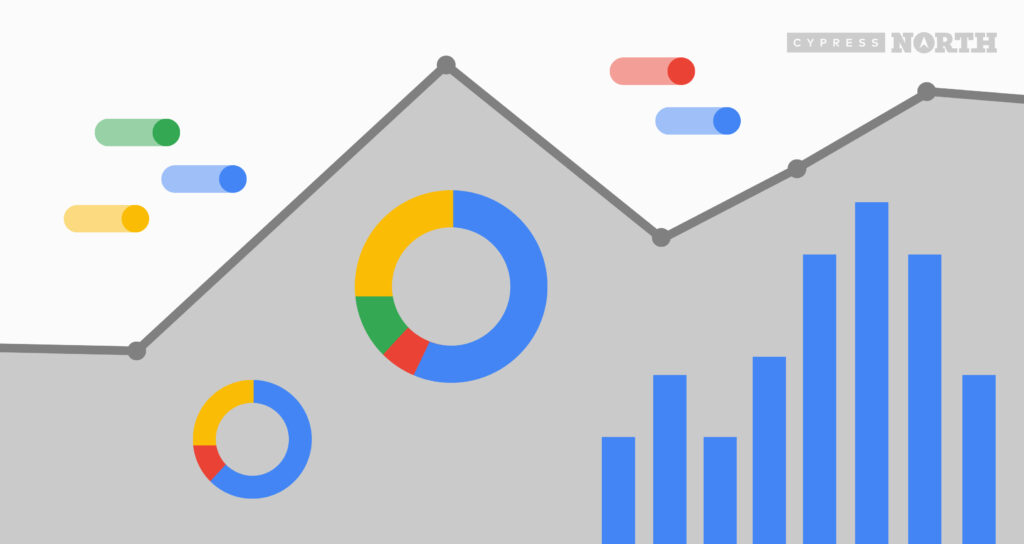
Google Data Studio Advanced Techniques: Blended Data, and Custom Metrics

Data Studio Advanced Techniques: Introduction
If you’re running any digital marketing campaigns, then you’re probably tracking their performance and the impact they have on the sales and/or marketing goals of your company as a whole. Most often, performance is tracked by manually entering multiple fields for each digital platform into an Excel or Google Sheets spreadsheet. That data is then interpreted into charts and/or graphs to determine how well each platform is performing.
By utilizing Google Data Studio, you’ll be able to skip the processes of logging into each digital marketing platform, manually entering data, and interpreting the data into charts and graphs. Data Studio can save marketers a lot of time by automating reporting, budget management, and performance tracking. If you’re running digital marketing campaigns, then I highly recommend you start using Data Studio and determine which reports and dashboards would best reflect your team’s performance toward achieving KPIs and goals. In addition to the basic functionality of Data Studio, there are some advanced techniques that you can use to make your reports much more robust and to include all of the data your team needs in one place.
Other than the automation aspect, Data Studio reports are much easier to work with and are generally much more aesthetically pleasing than excel spreadsheets. This also eliminates the step of having to design a PowerPoint or Google Slides presentation to present the results to the rest of your team. A Google Data Studio report can be designed with the end result (a presentation) in mind. Reports can easily be downloaded as a PDF without having to re-enter data or re-create charts and graphs since all data is automatically pulled in.
With that in mind, Data Studio is a must-have for all marketing teams running digital campaigns (which is everyone these days). Data Studio does provide basic templates, all you need to do in order to use these is log in and connect to your data sources (i.e., Google Analytics, Google Ads, etc.). However, I recommend building your own dashboard that reflects your unique goals and adding your corporate branding to give your reports more of a professional look. I’ll walk you through the steps of building out a custom report through a series of articles, and in this post, will show some advanced techniques that will blend data to report much more robustly, and in the end, eliminate a lot of steps to getting those metric totals.
The example I’ll use is a report I put together to reflect some of the design capabilities of Data Studio.

The above is the first page of the report, and it shows a summary of performance across all of the ad networks the example company is currently advertising on. To pull in this summary page, you’ll need to set up multiple different data sources and blend data. I’ll start with the remaining budget metric. To pull this in, I combined the total cost from Google Ads, Microsoft Advertising, and Facebook Ads then subtracted that total from their overall monthly budget. Here are the steps:
Set Up Blended Data
- Head to “Resource,” then “Manage added data sources:”

- Click “Add data source” then select the source you need to add
- Log in to the account to verify
- Add the source to the report
Repeat these steps for all digital platforms that you’re currently advertising on.
Now, you’ll need to pull in a custom budget metric. To do this:
- Create a new document in Google Sheets. The custom metric will pull in two cells with the upper cell as the header/naming function and the cell below as the metric.

- If your budget is the same across all months in the year, then just put your company’s name as the header/naming function, and then put your total budget for each month below.
- If it varies each month, you can repeat the same steps but for each month. You can also add one for the total budget for the year if you want to show yearly spend in your report.
- When the Google sheet is all set, connect your Google Sheet as a data source (the steps for adding a data source are listed above).*
*As you’re pulling in data, keep in mind that you can rename metrics and dimensions by double-clicking on them:

This makes it easier when you’re working with the data and creating a custom report. Once that’s finished, you’re ready to blend the data.
To blend the data:
- Click on the scorecard in your report
- Navigate to the data source in the right sidebar
- Click “Blend data,” which will enable this workspace:

- Click on “Add another data source”
- Select your digital ad platform
- Add the “Cost” metric across each platform*
*For some platforms, the name of the Cost metric might vary. For example, for Facebook, the metric is called “Amount Spent.” I also typically rename these metrics to ensure that I’m pulling the correct network when using the blended data source:

For the budget blended data, your workspace should now look like this:

Create Custom Metrics
Once your blended data is all set, continue onto creating the custom metric that will pull in your remaining budget value into your scorecard. Here's how:
- Navigate to the right sidebar
- Click on the metric field
- Click “Create field”

- Enter the metric name. For this case, I used “Remaining Budget”
- Enter in your formula. The formula I used for Remaining Budget was:
Company Name 3 - SUM(Google Ads Cost + Microsoft Advertising Cost + Facebook Ads Cost)

Once the formula and name are entered, be sure to change the type to “Currency:”

When you click “Apply,” the formula should be reflected in your scorecard:

Conclusion
Et voila! Now you are pulling in your remaining budget for each month automatically across all ad platforms without having to log in to separate accounts, manually record data, then interpret it into this visualization.
For more advanced reporting and Google Data Studio tips, subscribe to our newsletter so you don’t miss our next post.
For more marketing insights, take a look at our digital marketing podcast, Marketing O'Clock.
Related Resources
Is Your Digital Marketing Strategy Putting You at Risk? Understanding CCPA’s New Legal Precedent
Capital One’s privacy lawsuit highlights growing risks for marketers relying on standard tracking technologies. Here's what you need to know.

Using BigQuery to Overcome GA4 Data Retention Limits
Keep your GA4 data forever with BigQuery. Learn how to set up BigQuery to start storing raw GA4 data before it's gone for good.

Why US Businesses Need to Prioritize Data Privacy Now
The U.S. doesn't have a comprehensive national data privacy policy in place, but that doesn't mean businesses aren't being impacted. Learn more about the state-level policies reshaping digital marketing strategy and compliance.
![Data - Blog - Google Collab [Background]](https://cypressnorth.com/wp-content/uploads/2024/03/Data-Blog-Google-Collab-Background-640x360.jpg)
How to Get Started Using Python for Data Analysis in Google Colaboratory
Learn how to use the free Google Colab tool and perform data analysis with Python programming language in this tutorial for digital marketers and data analysts.

How to Save Universal Analytics Data
All historical data from Google’s Universal Analytics will be deleted on July 1, 2024. Learn more about what your options are for backing it up before it’s gone for good.

Is Google Analytics 4 a Tactical Move Away From Free Analytics?
There’s something fishy going on with the way that Google is handling GA4. To me, it’s playing out as a backdoor cash grab, hidden under a thin veil of a free and easy migration from UA.

Data Lakes & Data Warehouses: What Are They? (& Why Your Company Probably Needs Both)
Data lakes and data warehouses have gained increased interest from organizations in recent years for their ability to support a single source of truth for data-driven decision-making across various departments. Understanding the strengths and applications of each is important not […]

Microsoft Clarity Benefits & Drawbacks: A Comprehensive Review
Learn more about Microsoft Clarity, and our favorite features from Cypress North’s power users Updated June 2024 -- It has been two years since this post was first published - time flies! Microsoft Clarity has changed substantially since this post […]

How to Get Started with GA4: A Step-by-Step Guide
Need help setting up GA4 for your company or client’s website? Look no further! This post provides a step-by-step process for creating GA4 properties and best practices to make sure necessary events are tracked and the data flowing into GA4 are accurate.

How To Change Your Google Analytics Attribution Model in GA4
One of the biggest changes to Google Analytics has arrived in 2022 - the ability to change your Google Analytics attribution models. This is a first for Google Analytics as this attribution model change will not just apply to a […]
Why You Should Set Up Google Analytics 4 Today
Let's face it. GA4 isn't GR8. Google Analytics 4 is a work in progress to put it kindly. However, in these final weeks of 2021 you have an opportunity to get GA4 installed and tuned up, giving your future self […]

What to Include in a PPC Dashboard
Learn What Metrics to Include in PPC Reports. Then, Download Our Free Data Studio Dashboard Template! Let’s be real, pay per click advertising is all about data. What campaigns are bringing in the most revenue? What landing pages are converting […]

6 Google Ads Custom Columns to Help Uncover More Data
You may already know you can create custom columns in the Google Ads online interface. But, if you're anything like me, you may not always think about how you can leverage custom columns to surface essential Google Ads performance metrics, […]

How To See Audience Performace Across Campaigns With Google Ads Reports
Google Ads makes it really easy to see performance at the campaign or ad group level, but analyzing audience performance across multiple Google Ads campaigns is easier said than done. You're left wondering.... What's working well? What's not? Combining like-minded […]
Install Google Analytics on Web Stories With the Official WordPress Plugin
You read that right - the moment we've all been waiting for is here! Google’s Web Stories plugin is out of beta and now offers the ability to install Google Analytics on Web Stories directly in the plugin. If you […]
Cross-Domain Tracking With Google Tag Manager: A Simple Guide
Cross-domain tracking can make your life a lot simpler if you find yourself having to analyze Google Analytics data from two different sites. It allows you to capture the full user journey from the moment they land on one domain […]

Why Don't Multi-Channel Funnel Reports Match Up With Other Reports in Google Analytics?
Why don't numbers from the multi-channel funnel reports match up with numbers for the same metrics in other Google Analytics reports? The discrepancy is largely due to differences in what Google considers direct traffic. Read our guide to gain a full understanding of attribution differences in Google Analytics reporting.

Exploring a New Dataset With Python Part II: Using Seaborn To Visualize Data
Welcome to Part II of Exploring a new dataset with Python! If you missed Part I: The Basics, you can check it out here. In this article, we’ll be returning to our animal mug company’s dataset to continue our exploratory […]

Exploring a New Dataset With Python: Part I
We’re taking it back to the basics in this article. Why? The day of a Digital Marketer is busy. We’re pulled in all sorts of different directions and are responsible for a lot of different things. In my personal experience, […]

Strip Query Strings From URL Data: Python For Digital Marketing
If you’ve ever spent any time in a Google Analytics account, you’re all too familiar with the fact that the data isn’t always pretty. One exceptionally common scenario that us marketers run into all the time is page data being […]